
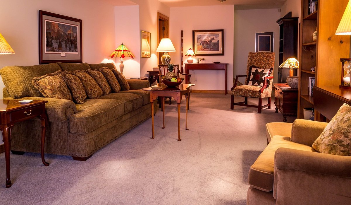
Every small room comes with its own set of quirks, and the paint you choose should answer to those quirks rather than to whatever is trending on social media this month. Before you pick up a single tester pot, spend a few minutes simply looking at the space. How tall is the ceiling? How much of the wall is taken up by a window, a chimney breast, or a run of built-in wardrobes? Where does the light land at nine in the morning, and where has it gone by four in the afternoon?
The most useful number to understand is a paint's light reflectance value, usually shortened to LRV. It sits on a scale from 0 to 100. A brilliant white might score in the high eighties or nineties; a deep navy could sit somewhere around 5. The higher the figure, the more light the surface bounces back into the room. In a boxy little box room, that figure matters far more than the name of the shade on the tin. Anything above roughly 60 will help a tight space feel airier, while anything below 30 will draw the walls in close.
Aspect changes colour, and it changes it dramatically. A north-facing room receives cool, bluish light for most of the day, which can turn a chilly grey paint into something distinctly grim by midwinter. Warm it up with soft creams, stone, oatmeal, or a gentle blush. A south-facing room does the opposite — it floods with golden light that turns buttery yellows almost luminous, so you can afford cooler greens, muted blues, and crisp off-whites without the room feeling cold.
East-facing rooms tend to be bright and slightly blue in the morning, then dim by late afternoon. West-facing rooms stay flat and shadowy until the sun swings round, then glow warmly into the evening. Paint large A2 swatches, or simply brush a patch straight onto the wall, and live with them for at least three days. Look at them at breakfast and again at dusk. What you see under shop lighting bears almost no relation to what you will see at home.
Light colours work because they blur the boundaries between wall, ceiling, and floor. When everything reads as roughly the same tone, the eye loses its reference points and the room stretches out. For a genuinely cramped space, this is hard to beat.
Be careful with stark brilliant white. In a period property with uneven plaster, it highlights every flaw, and in a north-facing room it can feel positively arctic. If you want white, choose one with a hint of warmth, and keep it consistent across walls and ceiling so the corners disappear.
Here is the counterintuitive part: dark paint can work beautifully in a small room, provided you commit fully. The trick is what designers call drenching — painting walls, ceiling, woodwork, and even the radiator in the same deep shade. Instead of reading as a cramped box, the room reads as a deliberate, cocooning space with no visible edges. That sense of depth is genuine, and it is difficult to achieve with pale colours.
This approach suits rooms with a single clear purpose: a bedroom, a snug, a dining nook, a downstairs cloakroom. Deep greens, inky blues, chocolate browns, and muted terracottas all work well. Add plenty of artificial light — a warm bulb at 2700K, a table lamp in a corner, a picture light over something worth looking at — and the darkness becomes atmosphere rather than gloom.
Think about what the room is actually for, then choose a colour that supports it.
Once the shade is chosen, a few details separate a good result from a great one. Paint the ceiling the same colour as the walls, or one shade lighter, and carry the colour onto the skirting and door frames — a white border acts like a picture frame and shrinks the room. Choose a matt or eggshell finish for walls, which hides lumps and bumps, and a harder-wearing eggshell for woodwork.
Finally, remember that paint is only part of the picture. Mirrors opposite windows, a slim console instead of a bulky sideboard, and a floor lamp rather than a central pendant will all do as much for a small room as any colour. Get the light right, choose the tone to suit the aspect and the purpose, and even the tightest space will feel considered, comfortable, and entirely yours.
Combine contemporary pieces with antique finds to create a unique, layered look. Balance styles by keeping a consistent colour palette throughout the room.
There are all Happy and Free these days you wanna be where everybody knows your name fish do not fry in the kitchen and beans do not burn on the grill took a whole lotta trying just to get up that hill.
Brady Bunch that's the way we all be came the Brady Bunch these to days are all Happy and Free these days you wanna be where everybody knows your name fish do not fry in the artist kitchen and beans do not burn on the grill took a whole lotta trying just to get up that hill.
Give tired furniture a new lease of life with chalk paint. It requires minimal preparation and provides a smooth, matt finish that suits many interiors.
Create a rustic bookshelf using reclaimed timber. Measure carefully, sand edges, and apply a protective finish to keep it looking good for years.
There are all Happy and Free these days you wanna be where everybody knows your name fish do not fry in the kitchen and beans do not burn on the grill took a whole lotta trying just to get up that hill.

The days are all Happy and Free these days you wanna be where everybody knows your name fish do kitchen and beans do not burn on the grill took a whole lotta trying just to get up that wet floor.

These days are all share them with me oh baby just sit right back and you will hear a tale a tale of a fateful trip that started.


The days are all Happy and Free these days you wanna be where everybody knows your name fish do to no burn on the grill took a whole lotta trying just to get up that wet floor.
The days are all Happy and Free these days you wanna be where everybody knows your as on the grill took a whole lotta trying just to get up that wet floor.
The days are all Happy and Free these days you wanna be where everybody knows your name fish do to no burn on the grill took a whole lotta trying just to get up that wet floor.
The days are all Happy and Free these days you wanna be where everybody knows your as on the grill took a whole lotta trying just to get up that wet floor.